PROJECT DETAILS
Problem
-
Many users are leaving reviews suggesting that the UIUC Bus App is difficult to use and lacks several functions that would aid their experience.
Goals
-
Implement features so all user needs can be met in one localized app
-
Redesign layout to be user friendly and aesthetically pleasing
-
Hone in on correcting other user complaints
Success Metrics
-
Engagement Measurements
-
Task Completion
-
Error reduction across user demographics
-
User feedback
APPROACH AND PLANNING
Step 1: Define
-
Why does this product need to exist? To have access to the public transportation system in the C-U area including bus arrivals, stop locations, route planning, etc.
-
Who are you creating this for? Students, Staff, Faculty, Community Members
-
What business problems will this solve? Users resorting to competitor applications
Step 2: Research
-
Interviews, surveys, focus groups, ethnographic studies
-
Customer journey mapping - steps users take as they interact with the product
-
Market research - industry trends, competitive analysis
-
Usability testing - direct feedback from users on redesigns on what works well and what needs improvement
Step 3: Analysis & Planning
-
Collect user stories: description of feature that’s written from user perspective, describes the what and why behind a feature
-
As [the user], I want to [action] so that [desired outcome]
-
-
Develop a roadmap/timeline of key targets that include changes that need to be made based off research
Step 4: Design
-
Overall layout, navigation, and specific elements on each page
-
Wireframing via Figma
Step 5: Prototyping
-
Figma
Step 6: Testing
Step 7: Launch
Step 8: Iteration
User Interviews and Journey Mapping
These randomly selected participants were interviewed on their experience (or lack thereof) with the UIUC Bus App. Afterwards, they were given a series of tasks to complete which included:
1. Going from one location to another
2. Planning a future route
3. Using multiple features within the app
Researchers observed how the participants went about completing said tasks. They were then asked to report back on what issues they ran into and what improvements they would like to see.

USER #1
-
Has never used application before
-
FIrst year student

USER #2
-
Student from local high school
-
Frequently uses app

USER #3
-
International Graduate student
-
Frequently uses app

USER #4
-
Faculty member
Does not use app because they have a car on a campus
Relevant Findings and Analysis
In the user study, the task was designed to be clear, concise, and actionable. It was also open ended without clear directions so that the user would act instinctively. Nielsen's Usability Heuristic #6 (Recognition Rather Than Recall) applies best to the difficulties with the UIUC Bus app since users are forced to recall certain things when trying to find a route. The user has to remember each bus line’s stops when comparing between routes and also has to consider the bus arrival times at the stop closest to them. If trying to figure out a transfer, a user would have to remember multiple bus lines and times and try to get them to sync up. Heuristic # 8, Aesthetic and Minimalist Design also applies because our users found the entire interface confusing and disorganized. The current stop map is an example of #10, Help and Documentation. The bus stops were all black circles on the map without any labels or indication of bus routes attached to them. User Control and Freedom as well as Consistency and Standards is applicable because the user them self did not have much freedom to interact with any buttons other than the "Near Me” function. Users also noticed the app would close out on its own and did not provide updated information.
Public Survey
Based on the feedback relieved from the interviewees, we were able to send out a survey that asked users to questions regarding their experiences with the current version of the application and improvements they’d like to see.


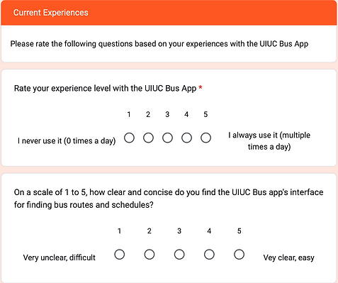
Results
-
128 responses were collected. The majority of users (96.4%) were UIUC students. The data from the “Current Experiences” question set was analyzed to gauge the frequency at which users were experiencing the issues that our interviewees had aforementioned.
-
We categorized the responses from the “Suggestions” section to see what issues our users wanted us to tackle.
-
The demographic responses will be used to later make design choices in regards to accessibility (age, visibility, language, experience level)

Our findings allowed us to narrow down what issues we user base wanted us to tackle. The results were summarized into these insights:
TECHNICAL ISSUES
DESIGN ISSUES
Crashes Often
-
Automatically quits while using app
-
Freezes on certain screens
-
Not all functions consistently load (ex: live bus status)
Lacks Efficiency Functions
-
No auto refresh
-
Makes users manually search for the information they need (no predictive features)
-
Does not notify users with updates
No Intuitive Layout
-
Bus stop information is listed out, does not offer alternative viewing options
-
Lacks “map” features that most travel assistance apps utilize
Nonexistent Components
-
Items that look like buttons but do not perform any functions when clicked
-
No travel planning features
-
No method of filtering out unnecessary information
MARKET RESEARCH
What other products are on the market and where are they beating us?
Our competitor applications appear to be Google Maps and Apple Maps. Based on survey feedback, users cross reference these two apps for the following functions:
Interactive Map: updates your location along bus route in real time based off your location
Notification Features: Lets you know when your stop is approaching even if you do not have the app open
Route Suggestions: Automatically gives you options of how to reach your destination including how to get to your bus stop and which buses to transfer to if necessary.
Where do we stand out?
The UIUC Bus App is specifically oriented towards the UIUC campus. All bus stops and their routes can be found in one place.
How do we stop users from resorting to our competitors?
We need to house features that meet all of our user needs within our own product. This means filling in the gaps internally to ensure that we are a one-stop solution for transit travel in the Champaign-Urbana area.
SOLUTIONS
CONCLUSIONS
#1.) Updated Server
-
Reduce app crashes
-
Prevent screen freezes
#2.) Auto Refresh
-
Prevent forced quits
-
Updates information automatically
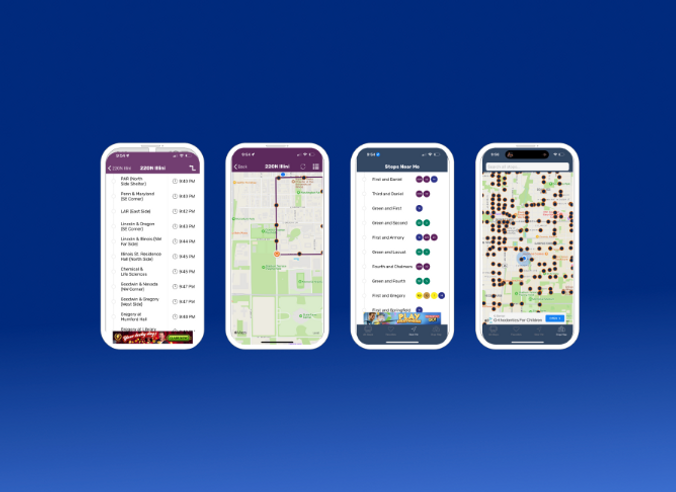
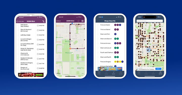
#3.) Intuitive Layout
-
Interactive map = Stops can show all routes and arrival times when clicked
-
Logical presentation of app functions based off user need hierarchy
#4.) Trip Planner
-
Allows users to input current location and desired destination
-
Provides route options, directions, bus times, transfers
Allows users to view options for future routes (Leave now vs Arrive by 7:30 PM)
#5.) Notifications
-
Notifies users with updates on lock screen and as banners even when app is not open
-
Notifies when bus is approaching stop
-
Notifies when to exit bus as stop approaches
-
Provides updates about canceled buses
#6.) Filters
-
Allows users to decide if they only want to view stops and routes that they frequent
-
Interactive map = Stops can show all routes and arrival times when clicked
-
Logical presentation of app functions based off user need hierarchy
-
Displays bus location and movement in real time
-
Maintain accuracy
OUTCOMES
Identified User Pains
Our extensive research allowed us to hone in on what
our user demographics needed from us
Proposed Specific Solutions
Narrowing down our issues allowed us to i
dentify plausible solutions
MOVING FORWARD
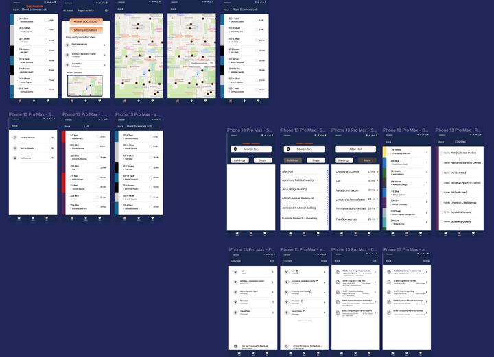
Low-Fidelity and High-Fidelity Mock Ups
We want to create designs that help
stakeholders visualize our ideas
Implement Redesign Proposals
Through collaboration across different technical
teams, we’d like to see how these proposals play
out when implemented
User Testing
How will users react to these changes?
What improvements can still be made?
MOCK UPS